How to coordinate exterior paint colors with your roof
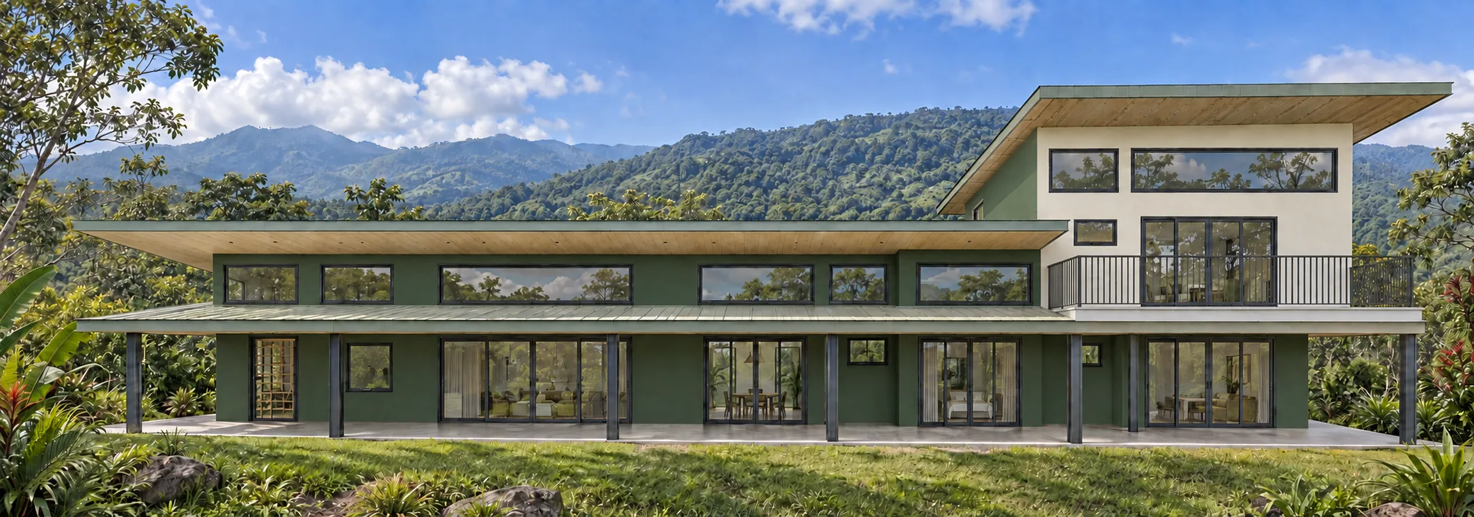
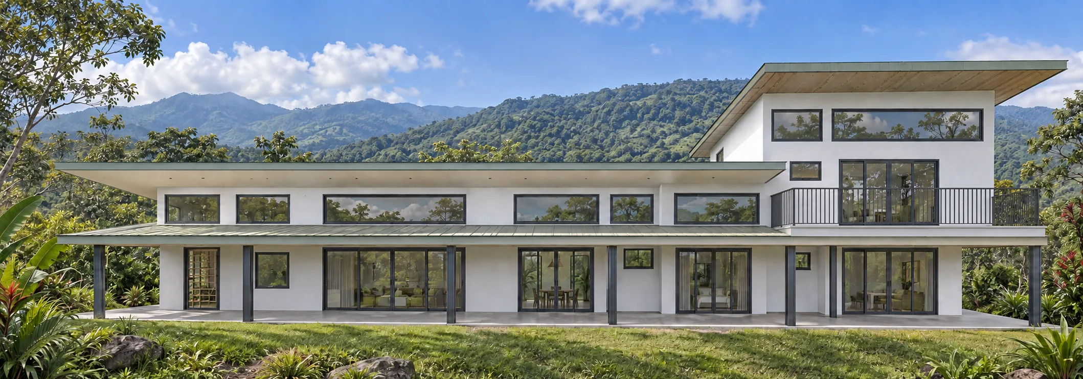
Start with the largest fixed material on the house, identify its undertone, and build wall and trim options around it.
Read the guideExterior Color Guides
Practical exterior-color guidance for homeowners making the decision and professionals helping clients move from options to an approved painting scope.
For homeowners
Coordinate fixed materials, understand outdoor light, compare color relationships, and test the finalists on your property.
Start with the largest fixed material on the house, identify its undertone, and build wall and trim options around it.
Read the guideTrim can sharpen the architecture, soften contrast, or connect walls to windows and fixed materials—white is only one option.
Read the guideExterior color is never viewed under one light. Learn what changes between the screen, the sample, and the finished wall.
Read the guideA reliable exterior palette starts with constraints, moves through whole-house comparisons, and ends with large outdoor samples.
Read the guideGive each color a clear job: a dominant field color, a supporting trim color, and a limited accent.
Read the guideTreat brick as a multicolor fixed material and coordinate with the impression it creates from normal viewing distance.
Read the guideStone contains variation; the useful reference is its overall temperature and visual weight on the house.
Read the guideA good door color leads the eye to the entry and belongs to the exterior palette without competing with every other feature.
Read the guideLight and dark exteriors change more than style—they change contrast, apparent scale, heat exposure, and how details read.
Read the guideExterior neutrals are rarely neutral in every setting; comparison reveals the undertone that isolation hides.
Read the guideEvery elevation receives a different pattern of sun and shade, so one paint color can look like several related colors.
Read the guideTropical light and vegetation amplify color decisions, while rain and humidity make product choice and maintenance part of the plan.
Read the guideLarge movable samples, multiple elevations, and repeated viewing reveal what a chip or phone screen cannot.
Read the guideA straight, evenly exposed photo with visible edges produces a more useful color-planning canvas.
Read the guideThe strongest use of visualization is comparing complete schemes and surface relationships—not predicting an exact finished color.
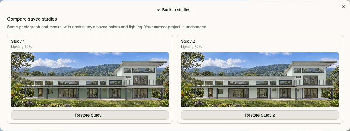
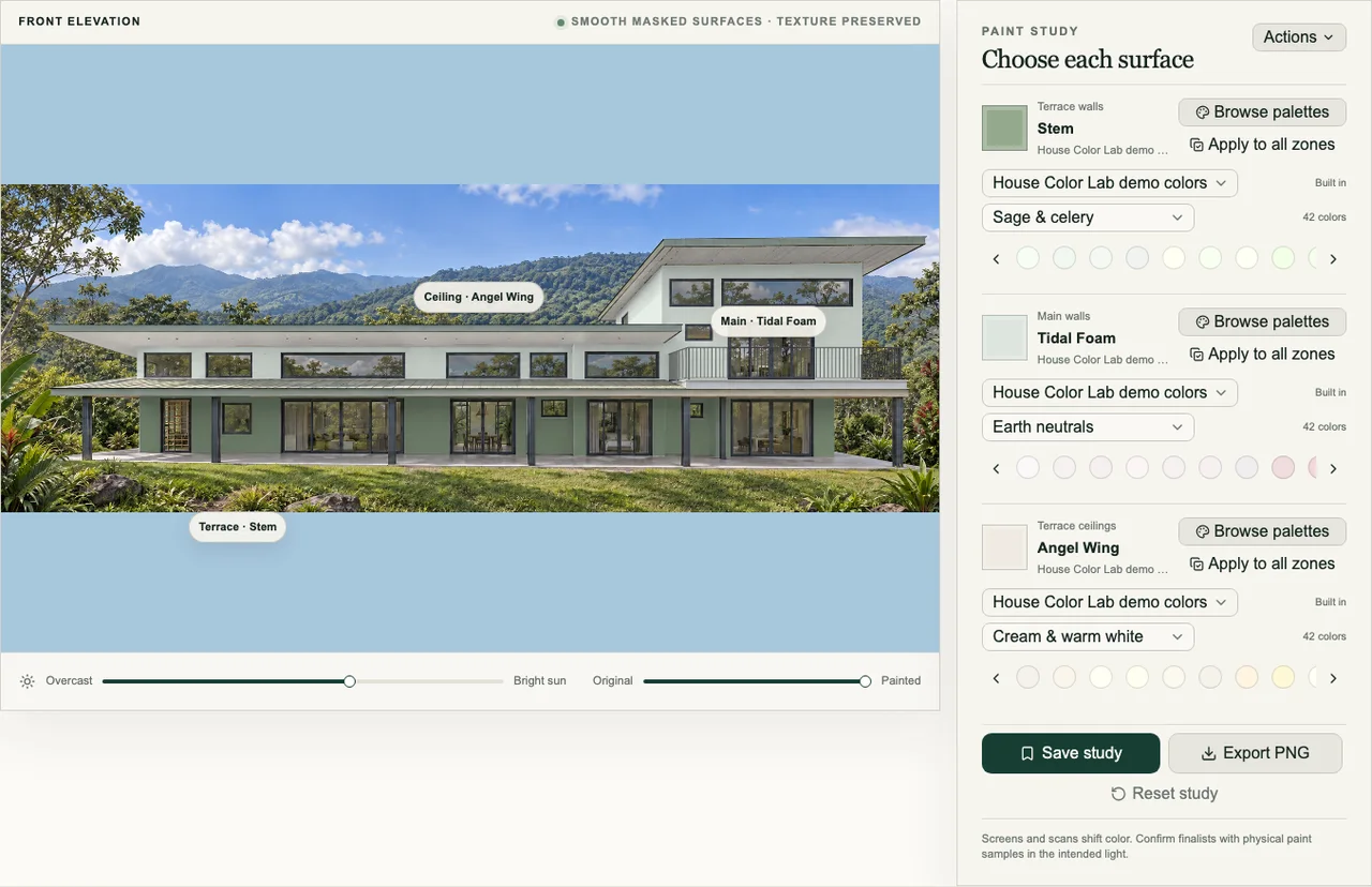
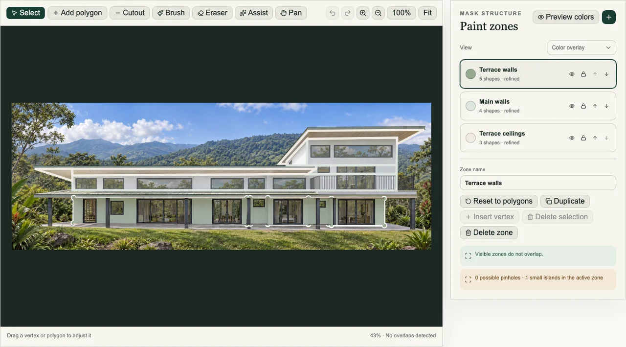
Read the guideThe same house, photograph, and surface boundaries make it easier to see what really changes between three complete exterior color directions.
Read the guideMost expensive color disappointments begin with skipped context: fixed materials, full-house scale, outdoor light, or proper samples.
Read the guideModern exterior color is less about one trendy shade and more about simplifying forms and controlling contrast.
Read the guideCurb appeal comes from a coherent first impression: a readable entry, coordinated materials, and details that know their role.
Read the guideFor painting professionals
Use visualization to clarify scope, guide client decisions, and carry an approved concept into production without promising that a screen replaces physical paint samples.
Replace open-ended color exploration with a defined sequence: constraints, distinct directions, focused revision, samples, and approval.
Read the guideA strong color presentation is a guided decision meeting, not a gallery of disconnected swatches.
Read the guideVisualization can make an estimate more concrete by showing what the proposed scope means—without turning the sales meeting into an unlimited design engagement.
Read the guide