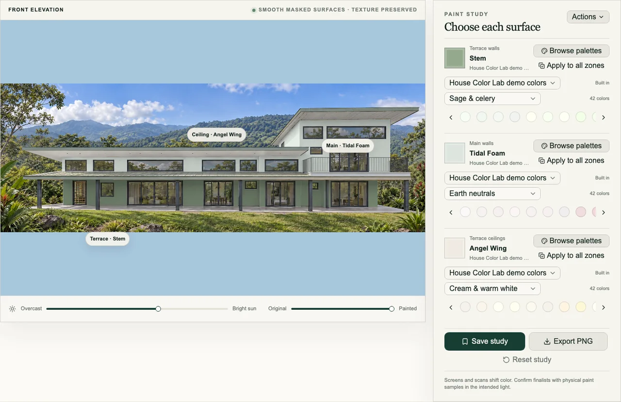
Define surfaces before exploring colors
Separate main walls, trim, ceilings, columns, doors, and accents according to how they will actually be painted. Clean boundaries make the comparison easier to trust and let you change one decision without rebuilding the rest of the scheme.
Do not create a separate zone for every small detail automatically. Group surfaces that should behave together and isolate only the features you may genuinely paint differently.
Explore directions before tiny differences
Start with meaningfully different schemes: lighter versus darker, warm versus cool, high contrast versus tonal. Save the strongest option in each direction. Once the overall relationship is right, compare closer shades within that family.
- Keep the roof, masonry, windows, and landscape visible.
- Compare whole schemes side by side instead of relying on memory.
- Name saved options by their decision, such as “warm walls, low-contrast trim.”
Use the preview as a decision filter
A screen cannot reproduce paint exactly. The photograph has its own lighting and color balance, and every display differs. Use visualization to reject poor combinations, understand color placement, and produce a short list. Finish the process with large real samples on the property.