Why use the same house for every comparison
Color comparisons become unreliable when the house, crop, light, or surrounding landscape changes between options. This case study holds the photograph and architectural boundaries steady, then changes the wall, trim, ceiling, door, and accent relationships as complete schemes.
The goal is not to name one universally correct palette. It is to show how value, temperature, contrast, and the fixed property context change the reading of the same elevation. The exterior paint color visualizer preserves the roof, windows, wood, paving, vegetation, shadow, and sunlight so those relationships remain part of the decision.
Three exterior color directions at a glance
Read each direction as a relationship rather than a paint prescription. The screen previews help identify which complete ideas deserve real manufacturer samples on the property.
Three complete exterior schemes compared on the same house photograph
1 of 3
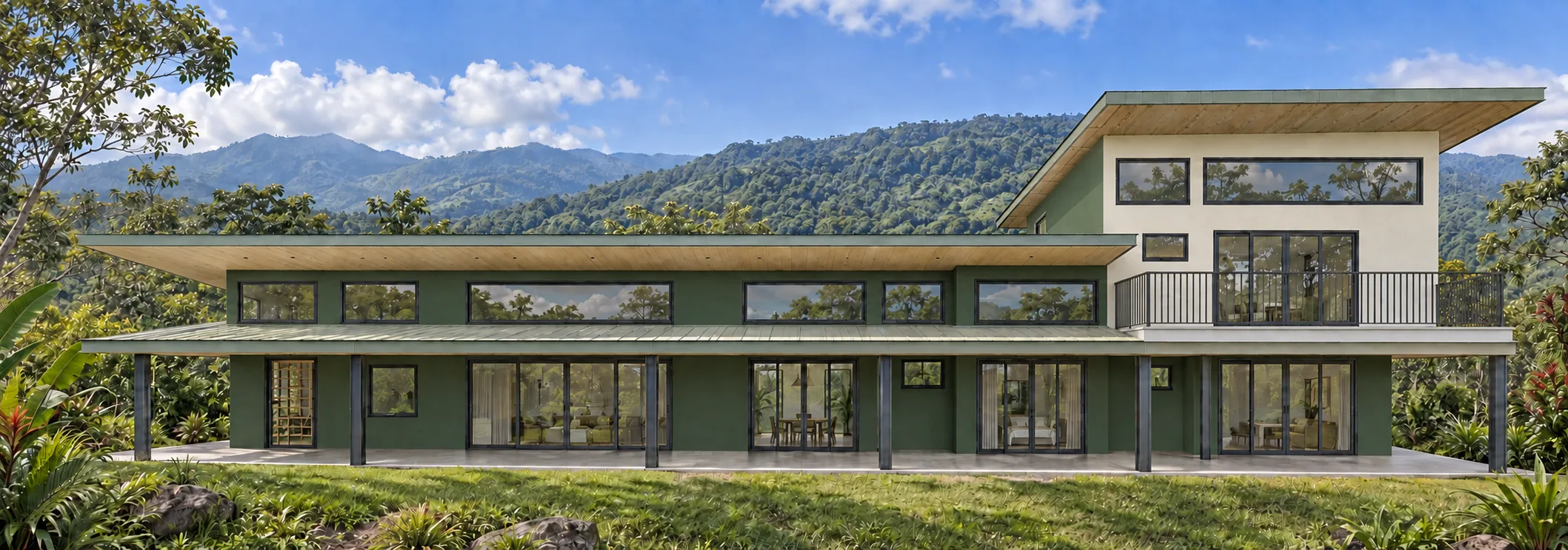
Direction 1: forest and linen
The muted green wall field relates directly to the tropical landscape. Light supporting surfaces preserve the long horizontal rooflines without drawing a bright outline around every opening. The result is lower contrast and visually quieter than the cooler or warmer alternatives.
This direction needs outdoor testing in the deepest normal shade. Reflected vegetation can make a balanced green preview feel cooler or more saturated on the real wall, while direct sun can make the same paint appear lighter and less colorful.
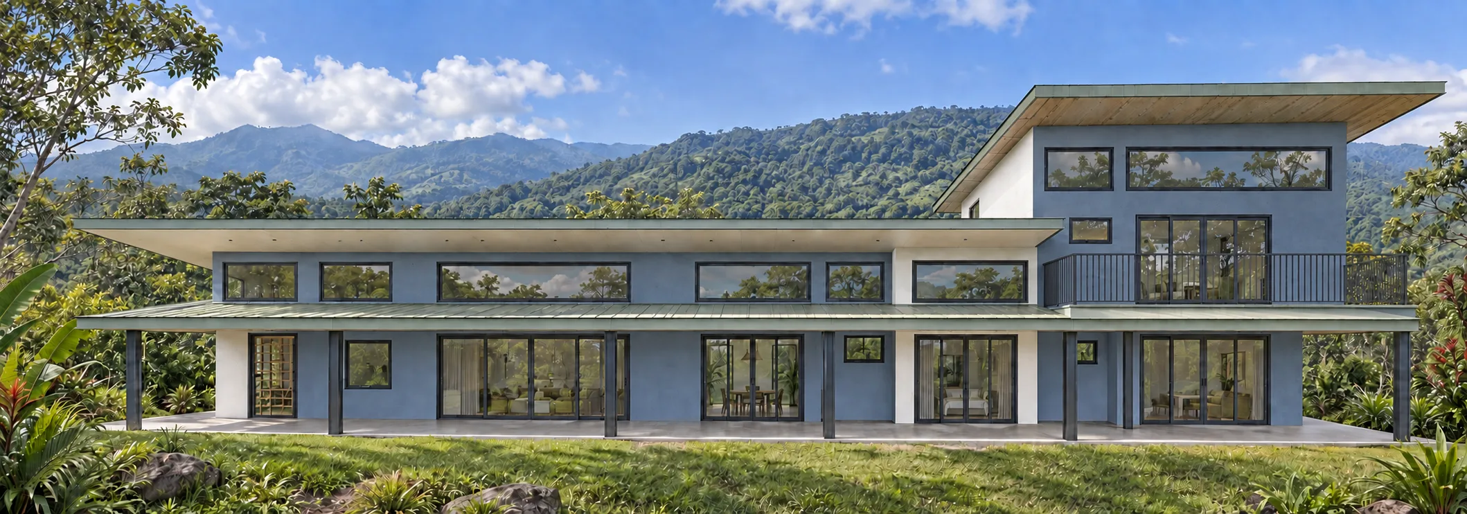
Direction 2: mineral slate
The slate direction separates more clearly from the vegetation and makes the repeated dark window frames feel deliberate. Its cooler temperature also changes how the pale walls and soffits read, even though the architecture and photograph have not changed.
Cool mid-tones can gain weight in deep shade. Compare physical samples beside the roof, window frames, and the darkest covered areas before deciding whether the scheme needs a lighter wall value or a quieter trim relationship.
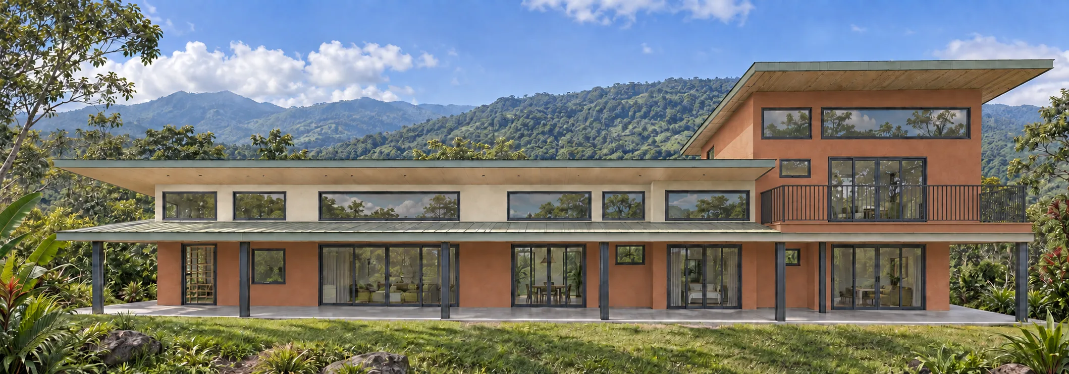
Direction 3: clay and sand
The warm clay wall field gives the house a stronger presence against the green setting. Softer warm supporting surfaces connect with the visible wood and avoid introducing an unrelated crisp white. Compared with forest and slate, this direction changes the temperature of the whole composition most noticeably.
Warm exterior colors are especially sensitive to roof undertones, paving, soil, and late-afternoon light. Large samples should be checked in both open sun and shade to make sure the relationship remains warm without becoming unexpectedly orange or pink.
What this comparison can and cannot decide
Holding the photograph and zone boundaries constant makes the broad decisions easier to see: blend or separate from the landscape, warmer or cooler overall temperature, and quieter or stronger contrast. It also reveals whether every surface has a clear role in the scheme.
The comparison cannot select an exact manufactured paint from a screen. Keep the strongest two or three directions, identify real manufacturer candidates, and follow the large exterior paint sample process in sun, shade, and changing daylight before approving the final specification.
- Keep the same photograph and surface boundaries across every digital comparison.
- Compare complete wall, trim, ceiling, door, and accent assignments.
- Name schemes by their decision instead of using generic option numbers.
- Carry only two or three meaningfully different directions into physical sampling.
- Record the final manufacturer, product, code, finish, and assigned surface.